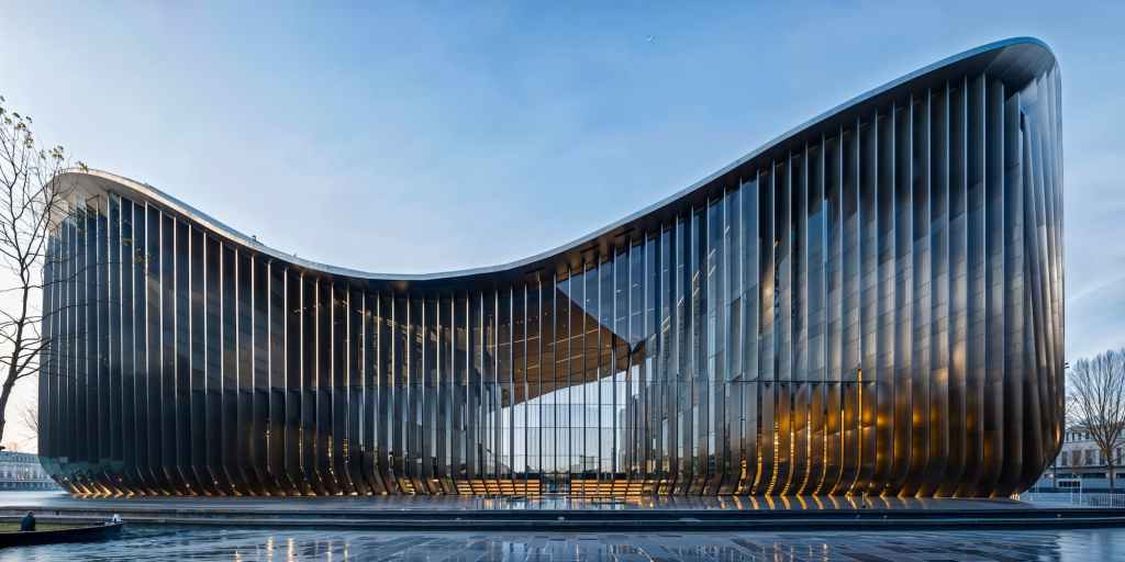
A plague of metal fins is washing over our buildings. The finicky fins are festooning the facades of office and institutional structures alike and are even wrecking the views of and from apartment buildings. Arrayed in patterns that sweep or stutter-step across expanses of glass and metal spandrels, they hint at a different scale or texture than the actual building provides but also break down the clarity of the structure.
Attached to glass and metal facades to provide nominal sun protection while preserving transparency, they also –supposedly—break down the bulk of structures too large to have what we think of as a human scale. In my opinion, they often don’t work and are a silly attempt to solve bad design.
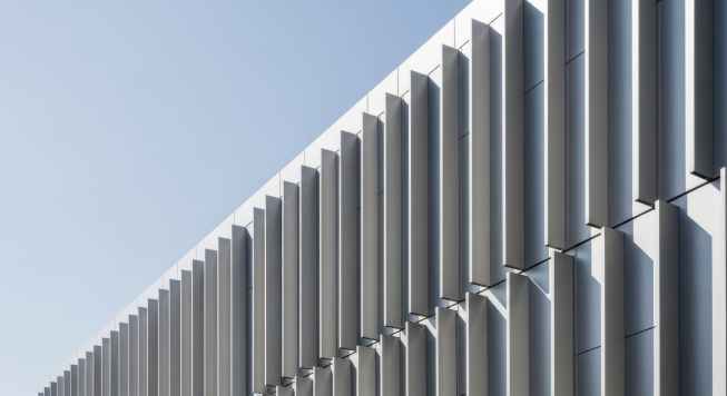
Photo: Adobe Stock Image.
These fins are everywhere. Walk through any downtown district anywhere in the world and you will see them covering at least part of most office buildings, especially those designed not by the firms that have large enough budgets and smarts to do something else. They are also often quite common as the covering for bulky institutional buildings, especially those serving the medical industry, that want to belie their essentially inward-turned and mechanical nature.
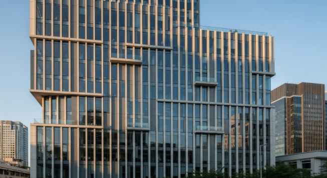
Photo: Adobe Stock Image.
But even schools and residential structures now sometimes have swatches of these spindles over those moments in the building that are mean to be open to both use and views but need to be either protected from the sun or made to look like they are part of the overall composition.
The roots of this ticky-tacky tack-on strategy are respectable. Their parentage goes back at least to the Apollonian and Dionysian godfathers of mainstream modernism.
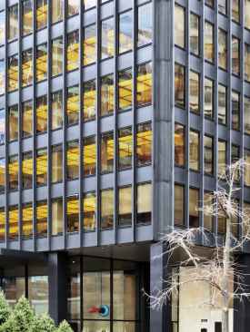
On the one hand there are the pared-down derivatives of the pasted-on I-beams Ludwig Mies van der Rohe used most famously on the Seagram building, both to express the interior vertical structure and to break up the façade’s grid.
On the other hand they aim to do the purpose of the “brise soleil” Le Corbusier adapted from tropical houses he had seen on his travels. For the expressive architect, they became a device to shade what he wanted to be spaces as open to the outside as possible.
As the I-beam lost its articulation and became ever thinner and cheaper in the hands of less talented architects and developers, and as the brise soleil left only a memory of itself in a similar race to the economic and constructional bottom, most of the rationale these elements had was lost, along with any beauty their rhythms might have provided. They became thin, standardized, and disconnected from the logic of either construction or site. They are now mostly just gestures towards articulation.
The other reason for the appearance in the last decade or so of these fins, now usually consisting of lightweight metal or GRFC struts tacked on with either bolts or welds, is the evolution of our energy codes. As these have become ever stricter, it becomes increasingly difficult to get away with the open stretches of glass that seem to be the default way in which especially office buildings are meant to appear, both for economy and for an association with modernity.
The alternative to the post-design solution is larger non-vision panels, which reduce views and make buildings appear even more hulking, or darker glass with higher sun shading properties, which have the same problem. The latter were popular during the 1970s and 1980, which makes them even less popular today, while the former is equally unpopular among clients and their designing servants who want that open look.
An alternative the fins is to apply fritting to the glass itself in patterns that, again, both respond to the sun and break up the gridded expanse of panels that is the default mode of even the twisty-est and Jenga-est complex.
The history of this technique is much younger, dating back to the 1990s when it was first used, as far as I can tell, by the likes of the Office For Metropolitan Architecture (OMA) and other avant-modernist firms. The frits then spread across facades to become either elaborate geometric patterns of pictures that, in the work of firms such as Herzog & de Meuron, tell stories about what is going on behind the glass in a matter not unlike the advertising on buses.
When done well, fritting can have a kind of Pop Art appeal, but it always runs the danger common to such surfing on popular culture: its appeal quickly wears off. Moreover, there is the practical problem that it reduces visibility from the inside. And, like all techniques that take some imagination to work well, it becomes the equivalent of shag carpet in the hands of bad architects designing the kinds of buildings you see on the way to the airport. It covers their faults with a modesty rag.
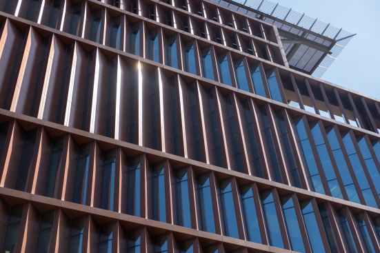
Photo: Adobe Stock Image.
The problem is that all these solutions are decorative in their very essence and in manner that belies the strategy of extending and enhancing a building’s design through such articulation. Instead of relying on a building design that uses intelligence to respond to its program, its site and its larger cultural context, its users, and the need for architecture to improve our lives with each expenditure of carbon it entails, finning is an band-aid applied to the contradictions bad designs create. It tries to provide transparency and energy efficiency, scale and textures, and perhaps even a reduction of bird deaths with an additional element and thus both economic and environmental cost. I would also be hard-pressed to name a single building in which it is not just plain ugly.
The ultimate solution is thus to design in a manner that makes such frivolous fins unnecessary –or to not build any new buildings, as I have argued before. If architects are stuck with the need for such metal frippery, it might behoove them to, as always, look at those who came up with the idea first and did it best.
The views and conclusions from this author are not necessarily those of ARCHITECT magazine.
Read more: The latest from columnist Aaron Betsky includes reviews of: The Modern Museum | Monuments | Infrastructure | Interior Design | Viollet-le-Duc | Malibu High School | Architecture without Architects | Louis Kahn’s Fisher House | Meow Wolf | Generative AI | Frank Gerhy | Robert A.M. Stern | Lars Lerup | Princeton Art Museum | Victor Legorreta | Mexico City Underwater | On Vitruvius | On Olive Development | Calder Gardens | White House and Classical Architecture | Louis Kahn’s Esherick House | Ma Yansong’s Fenix Museum | The Cult of Emptiness | An Icon in Waiting | Osaka Expo | Teamlab | the Venice Biennale of Architecture | On Michael Graves | On Censorship or Caution? | Uniformity in Architecture | Book on Frank Israel | Legacy of Ric Scofidio| Fredrik Jonsson and Liam Young | DSR’s New Book | the Stupinigi Palace | Living in a Diagram | Bruce Goff | Biopartners 5 |Handshake Urbanism | the MONA | Elon Musk’s Space X | AMAA | DIGSAU | Art Biennales | B+ | William Morris’s Red House | Dhaka | Marlon Blackwell’s new mixed-use development | Eric Höweler’s social media posts,| Peter Braithwaite’s architecture in Nova Scotia,| Powerhouse Arts, | the Mercer Museum, | and MoMA’s Ed Ruscha exhibition.
Keep the conversation going—sign up to our newsletter for exclusive content and updates. Sign up for free.