Is a museum a place for a community to come together around art that both grounds and opens perceptions about the world around them? Is it a monument to our collective cultural achievements and aspirations? A storehouse for those treasures that amaze us?
A machine for bringing people and art together? Yes. A modern museum is all those things and more. Its architecture should make that possible. Two new edifices in Manhattan show how the art institution can be all those things but also hint that perhaps you can’t have it all.
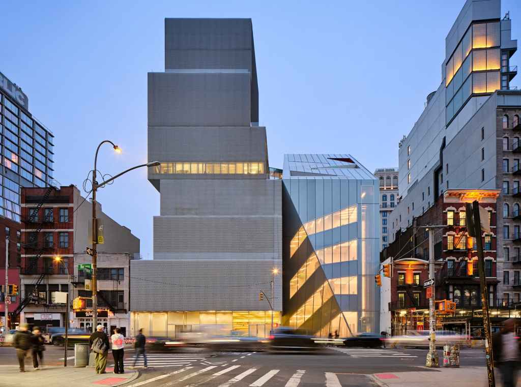
Exterior view of the Studio Museum in Harlem's new building, 2025. Courtesy Studio Museum in Harlem. Photo: © Albert Vecerka/Esto.
Of the two, the Studio Museum in Harlem is the most ambitious and also the one that is a completely new building, replacing an older structure on Harlem’s thoroughfare, 125th Street. The addition to the New Museum on the Bowery in lower Manhattan is an add-on, albeit one that doubles the square footage of the original building, which itself is a little less than twenty years old.
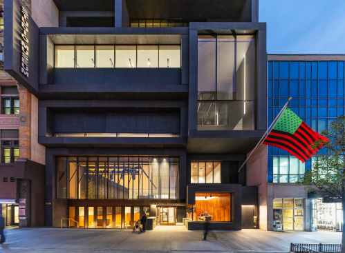
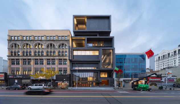
Exterior view of the Studio Museum in Harlem's new building, featuring David Hammons's Untitled flag (2004), 2025. Courtesy Studio Museum in Harlem. Photo: © Albert Vecerka/Esto.
The Studio Museum in Harlem was designed by Sir David Adjaye and finished by his firm and the Museum after the architect had to step back because of numerous sexual harassment accusations. It is also the monument to the achievements of Thelma Golden, the charismatic Director who has steered the Museum onto a path that has warranted such a large (82,000 square feet) building.
Monumental it is. It towers over its block. Like all good contemporary architecture, it understands, assimilates, condenses, and then gives us back in an abstract and larger form a context that ranges from rows of commercial and office buildings from various eras to the Neo-Brutalist Adam Clayton Powell Jr. Federal Building across the street.
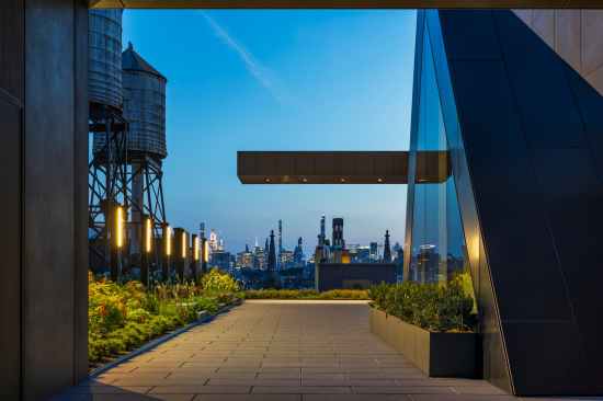
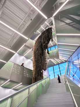
The Studio Museum in Harlem's new terrace, with views to the south. Courtesy Studio Museum in Harlem. Photo: © Albert Vecerka/Esto.
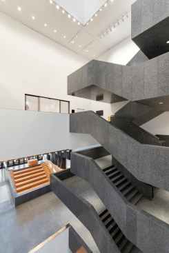
It piles up an implication of voluminous boxes with slight indents and pushouts that animate the façade and terminate in a full-blown mechanical housing object looming against the sky. All that composition hovers over a glass ground floor that sucks you into a space which then plunges down to a lower atrium along the by now requisite stair/auditorium hybrid before depositing you at the base of a skylit atrium inhabited by monolith of a staircase.
The building’s grandeur, in other words, starts on the street as compositional signal and then becomes spatial in the public spaces. By cladding the building in black-tinted concrete and deploying the same sort of reductive detailing that makes the Princeton Art Museum so crisp, Adjaye has created one of the most dramatic new museum buildings of recent years.
It is quite awesome, but that very awe causes questions to rise in my mind. By placing the atrium in the thin building’s center, the architect has eaten up what appears to be almost half the site’s space with voids, sending long fingers of otherwise not very useful corridors in either direction to connect the galleries.
The actual display spaces are split and stacked; in fact, they feel almost like a white-walled afterthought. Functional but without character, I am sure they are meant to defer to the art, but they make the experience of art the same as you would have in any recent museum –or commercial art gallery.
The Studio Museum in Harlem-25-03, Location: New York NY, Architect: Adjaye Associates, Client: The Studio Museum in Harlem
It appears that Golden has here made the expression of collective pride primary. This is not an art museum so much as a celebration of Black culture. As such, it is impressive, and during my visit, a few months after its opening, it was busy, though not crowded. To me, the building feels, despite its size and the almost $200 million cost, like a first step,
in the tradition of the monumental front, entrance, atrium, and first galleries communities used to build for their cultural institutions in a mode that mimicked temples, before they then added ramble after ramble of functional art galleries after the proof of concept had succeeded.
The New Museum. Courtesy New Museum. Photo: Jason Keen.
The New Museum is already such an addition to a similar stack of blocks. What is even more remarkable, it took only a few years for the New Museum to warrant the addition to the 2007 building. White, not black –signaling its different audience, however unconsciously, even if through its abstraction and lightening of the classical tradition—Kazuo Sejima’s original building rose out of what was then still a derelict part of the city with a delicacy and enigmatic poise that combined the grand with the ethereal.
The interior was even more radical: a stack of concrete-floored boxes whose proportions were vertically elongated, with not a grand staircase or atrium in sight. You moved between the floors either by the fire stairs tucked in the rear or in freight elevators that deposited you without ceremony into the display spaces.
Rarely in recent years has a public institution received a home that appeared more matter-of-a-fact and dramatic at the same time. The eeriness that is essential to Sejima’s architecture was here on full display and turned the edge the New Museum had long provided to the New York art scene into a built reality.
The New Museum. Courtesy New Museum. Photo: Jason Keen.
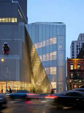
The new building, designed by Shohei Shigematsu of the Office for Metropolitan Architecture (OMA), with Rem Koolhaas looking over his shoulder (“Partner in Collaboration,” according to the Museum’s fact sheet), appears at first to be more radical but turns out to do the even more radical, but very OMA thing of normalizing the existing structure.
Appearing to lean with either affection or lack of conviction against the existing building because a diagonal slash runs four level up the façade to create a slice of pavement meant to be a public space, it then tilts back at ninety degrees to that gesture with two floors of offices, studios, and yet another auditorium/stairs concoction (to be fair, OMA are the one who first developed what has by now become a cliché in their Rotterdam Kunsthal of 1993).
What is left of the façade is covered in a scrim like, but less delicate than that of the existing façade, broken up into a pattern that seems to have no function other than to reduce the building’s scale while providing a way to cheapen construction.
I am at a loss to see what the building has to do with its surroundings, but at least it is deferential to the original in manner that is thoroughly modernist: abstract, elemental, light, and constructed visibly of human-made materials. It also lines up nicely with Prince Street, though progressing towards a slash is a slightly uncomfortable take on the architectural axis.
The New Museum. Courtesy New Museum. Photo: Jason Keen.
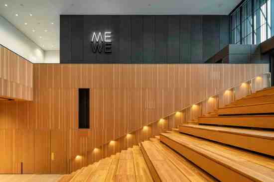
The vastly expanded lobby now feels like it really is such a reception hall, rather than being a loft space with a desk, shop, and café plunked in it. That is even more so because OMA have provided the drama of the grand stairs Sejima refused to give us.
Twisting and turning its way up those four public floors, that circulation element is clad in more expanded metal mesh, backlit to reveal a green backing that curiously makes it resemble an element of a Prada store –one of OMA’s main clients.
The detailing is, unlike in the Studio Museum in Harlem, rough and ready. In the OMA tradition, it revels in cheap fasteners and the collision of materials and appendages, rather than trying to smooth out those moments. This is modernism in the assemblage, lo-tech tradition of which this firm is still the master. The result is what you get for $60 million and an army of designers who know how to make “no money no details” look good.
The galleries are, like those at the Studio Museum in Harlem, serviceable and spacious –which is exactly either the problem or the point. What was an experience unlike any other in the original New Museum building has now become one of a default gallery meander from one neutral environment to the other.
The one bit of idiosyncrasy is that, because of the original layout, you must either double back to the public stairs or resort to those fire stairs again. I am happy the institution has so much new space. I just wish OMA had found a way to think about that task in a less clichéd manner.
What OMA has done is to normalize the New Museum. That is, perhaps, fitting. What was once a radical institution is now almost as staid as the institution against it rebelled, the Museum of Modern Art, which was, in turn, once avant garde itself.
The Museum now has the art institutional version of all mod cons: the grand entrance under the gash, the formal lobby, the grand stairs, the ramble of galleries, and yes, even the auditorium/stairs. That the architects have jammed all that into a small lot and made the transition to the original so seamless as to almost disappear is a credit to their skill.
What then do these buildings tell us about the future of the art museum, or institutional architecture in general? Should it devote most of its space to public signaling and community celebration, or should it jam as much art as possible into galleries while utilizing the formal elements we expect in such buildings?
These two new buildings show that, whatever nuance such structures exhibit, the museum here is still rooted in traditions and expected modes of behavior, while trying to remain new through abstraction and gesture.
The results are nice, but each disappointing in their own way. We will have to look beyond our cultural capital of Manhattan, and perhaps this country, to find new modes for the art museum in coming years.
The views and conclusions from this author are not necessarily those of ARCHITECT magazine.
Read more: The latest from columnist Aaron Betsky includes reviews of: Monuments | Infrastructure | Interior Design | Viollet-le-Duc | Malibu High School | Architecture without Architects | Louis Kahn’s Fisher House | Meow Wolf | Generative AI | Frank Gerhy | Robert A.M. Stern | Lars Lerup | Princeton Art Museum | Victor Legorreta | Mexico City Underwater | On Vitruvius | On Olive Development | Calder Gardens | White House and Classical Architecture | Louis Kahn’s Esherick House | Ma Yansong’s Fenix Museum | The Cult of Emptiness | An Icon in Waiting | Osaka Expo | Teamlab | the Venice Biennale of Architecture | On Michael Graves | On Censorship or Caution? | Uniformity in Architecture | Book on Frank Israel | Legacy of Ric Scofidio| Fredrik Jonsson and Liam Young | DSR’s New Book | the Stupinigi Palace | Living in a Diagram | Bruce Goff | Biopartners 5 |Handshake Urbanism | the MONA | Elon Musk’s Space X | AMAA | DIGSAU | Art Biennales | B+ | William Morris’s Red House | Dhaka | Marlon Blackwell’s new mixed-use development | Eric Höweler’s social media posts,| Peter Braithwaite’s architecture in Nova Scotia,| Powerhouse Arts, | the Mercer Museum, | and MoMA’s Ed Ruscha exhibition.
Keep the conversation going—sign up to our newsletter for exclusive content and updates. Sign up for free.